Reframing Landmark's Onboarding Experience

Responsibilites:
Design Thinking, Information Architecture
Tools:
Figma
Duration:
2 weeks
Role:
UX/UI Designer, Prototyping
Project Overview
This project focuses on re-designing Landmark Cinema's "Create an Account" flow on their website.
The Problem
The current user flow for creating an account with Landmark has a poor user experience with the absence of segmented sections and input fields spanning the entire page. The input fields provide limited feedback when inputting the wrong information and fail to provide enough context to the user when creating a password or inputting an address.
Exploration & Insights
Current User Flow
Upon accessing the site, the layout of the input fields caught my attention—spanning the entire page, causing potential strain on the eyes. The absence of segmented sections for these fields could overwhelm users when attempting to view all information simultaneously.
My exploration revealed that inputting random data into various fields yielded limited feedback, with only the "email" and "confirm password" fields triggering responses. Surprisingly, the "postal code" field provided no error indication. I also noticed text elements like field labels and film genre titles displayed in a notably small font size. Lastly, the "Create Account" button remained clickable even when incorrect information was inputted, indicating a lot of room for improvement within this user flow.

Low Fidelity Wireframes
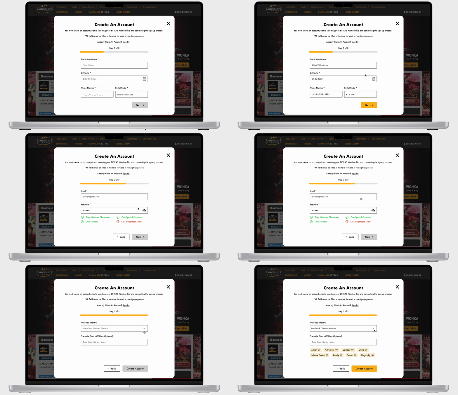
I started by strategically categorizing and separating the input fields into three sections—personal details, account details, and personal preferences—to mitigate cognitive overload. As I’ve introduced constraints, I have also included a progress bar for each step of the user flow so users understand that there are several steps to complete and so they are aware of what step they are currently on.


High Fidelity Prototypes
In the hi-fi wireframes, I opted to present this user flow as a pop-up. Users can easily click out of it if they choose not to create an account, rather than redirecting them to a separate page. This approach aims to prevent users from feeling disconnected from the rest of the website.
I've also integrated prompts within each field to guide users on the expected input and clarified password requirements below the "Password" field, enhancing user awareness of necessary password criteria. This structuring aims to guide users through the process, preventing information overload and ensuring a more user-friendly experience.
Lastly, I’ve implemented a system pattern by disabling the "Next" button until all mandatory fields were completed, enhancing user guidance. This contrasted with the original design where the lack of this pattern led to user confusion upon selecting the call-to-action without all necessary information entered.


